
Views: 257 Author: Maituohong Packaging Publish Time: 2026-09-16 Origin: Site


Content Menu
● What Is Minimalist Perfume Packaging?
● Why Minimalist Perfume Boxes Create a Premium Impression
>> It Makes Materials More Visible
>> It Supports a Timeless Brand System
● Seven Minimalist Perfume Packaging Ideas
>> 1. Monochrome Rigid Boxes With Blind Embossing
>> 2. Typography-Led Perfume Box Design
>> 3. Black-and-White Perfume Packaging With One Accent
>> 4. Natural Kraft and Recycled Paper Packaging
>> 5. Soft-Touch Boxes With Subtle Foil Details
>> 6. Minimalist Window Packaging With Purpose
>> 7. Magnetic Closure and Book-Style Perfume Gift Boxes
● How to Choose the Right Perfume Box Structure
● A Practical Design Process for Custom Perfume Packaging
>> Step 1: Define the Brand Message
>> Step 2: Confirm Bottle Specifications
>> Step 3: Select a Packaging Structure
>> Step 4: Build the Material and Finish System
>> Step 5: Review a Physical Sample
● Responsible Packaging Choices Without Empty Claims
● Create a Perfume Box That Feels Like Your Brand
● FAQs About Minimalist Perfume Packaging
>> What makes a perfume box look minimalist?
>> Are rigid boxes suitable for perfume packaging?
>> What is the best insert for a perfume bottle?
>> Can minimalist perfume packaging still use foil stamping?
>> Is kraft paper suitable for luxury perfume boxes?
>> How can perfume brands make packaging easier to recycle?
>> What information should I provide before requesting a custom perfume box quotation?
Minimalist perfume packaging is not about removing every detail. It is about selecting the right details—the ones that make a fragrance feel premium, memorable, and unmistakably yours. For fragrance brands, a well-designed minimalist perfume box can turn a first physical interaction into a quiet statement of quality, confidence, and care.
At Maituohong Packaging, we have spent more than 18 years designing and manufacturing custom rigid boxes and paper packaging for brands that need more than basic protection. We have seen that the strongest luxury perfume packaging does not rely on crowded graphics or excessive decoration. Instead, it uses precise structure, tactile materials, disciplined typography, and thoughtful opening rituals to make the product feel valuable before the customer even sprays it.
Whether you are launching an indie fragrance, refreshing a luxury collection, creating a gift set, or developing retail-ready perfume boxes, this guide will help you build minimalist packaging that looks refined, protects the bottle, supports practical production, and creates a stronger customer experience.
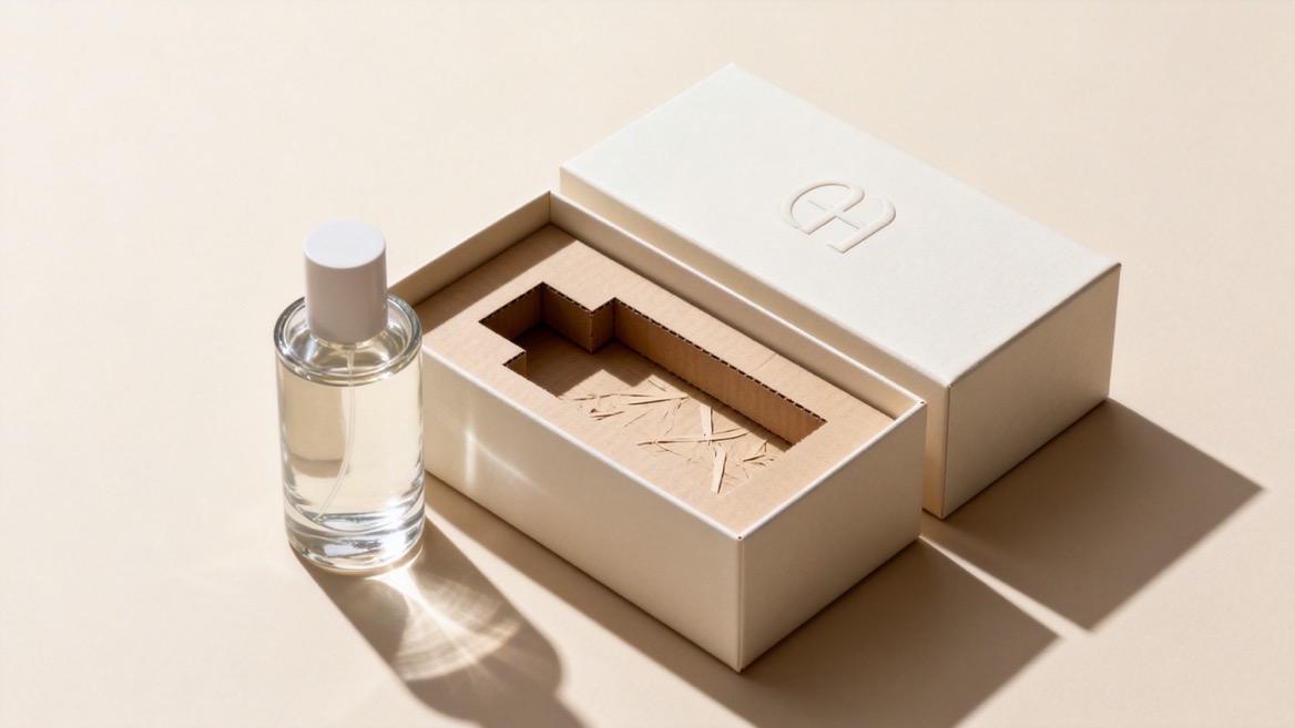
Minimalist perfume packaging uses a reduced visual language to communicate a clear brand identity. It removes unnecessary graphics, colors, and messages so that the most important elements—such as the fragrance name, brand mark, material texture, and box structure—can stand out.
The goal is not to make the package look empty. The goal is to make it look intentional.
A minimalist perfume box commonly includes:
- A clean front panel with limited copy
- One dominant color or a controlled neutral palette
- A simple brand mark, monogram, or wordmark
- Carefully selected typography
- High-quality rigid board or premium paperboard
- Tactile finishes such as embossing, debossing, soft-touch lamination, or subtle foil
- A secure insert that keeps the perfume bottle stable
- A considered opening experience, such as a lift-off lid, drawer box, book-style box, or magnetic closure
For luxury fragrance brands, simplicity can signal that the product does not need visual noise to justify its value. The material quality, construction accuracy, and finishing details do the work.
Perfume is emotional. Customers do not only buy a scent; they buy mood, identity, memory, status, and ritual. Packaging is the first physical evidence of that promise.
A minimalist approach helps a fragrance brand communicate these qualities with more clarity.
A crowded perfume carton can force the eye to process too many competing details. When the brand name, scent name, volume, and visual system are clearly organized, customers can understand the product faster.
For example, a white rigid perfume box with a blind-embossed logo, a centered fragrance name, and a single line of foil text may feel more premium than a box covered with gradients, illustrations, and promotional claims.
The result is a package that is easier to recognize on a shelf and easier to remember afterward.
Minimal graphics place more attention on the physical package. That means weak materials and poor construction become obvious—but so do excellent details.
A high-quality rigid box can communicate luxury through:
- The firmness of the board
- The smoothness or texture of the wrap paper
- The precision of the corners
- The consistency of the color
- The resistance of the opening mechanism
- The fit between the bottle, insert, and outer box
This is why structural quality matters so much in minimalist perfume packaging. When the design is quiet, every production detail becomes part of the brand story.
Fragrance trends change quickly. A packaging system built around a restrained color palette, clear type hierarchy, and a recognizable structural form can last longer than highly seasonal artwork.
This is particularly useful for brands that plan to expand into:
- Eau de parfum collections
- Travel-size fragrances
- Discovery sets
- Holiday gift sets
- Refillable perfume programs
- Limited-edition scents
- Home fragrance and candle lines
A disciplined packaging system lets you introduce new fragrances without losing brand consistency.
The following approaches can be adapted for luxury, niche, natural, unisex, gift-focused, and direct-to-consumer fragrance brands.
A monochrome rigid box is one of the clearest expressions of modern luxury. Use one exterior color and let a blind-embossed or debossed logo provide depth without adding visual clutter.
Soft white, warm gray, charcoal, cream, deep forest green, muted blue, and black are strong choices. The best color depends on the scent profile and the brand's overall positioning.
This style works especially well for:
- Niche fragrance houses
- Unisex scents
- High-end gift editions
- Minimal skincare-inspired fragrance brands
- Premium sample or discovery collections
For a stronger tactile moment, pair the embossed logo with uncoated paper, soft-touch lamination, or a linen-textured wrap.
Typography can become the main visual feature when a brand has a strong name, an evocative fragrance title, or a clear editorial identity.
Instead of using decorative graphics, let the typeface communicate the personality of the scent:
| Fragrance Positioning | Suitable Typography Direction | Packaging Effect |
|---|---|---|
| Classic luxury | High-contrast serif | Elegant and heritage-focused |
| Contemporary niche | Clean sans serif | Modern and confident |
| Botanical or artisanal | Restrained serif or humanist sans serif | Natural and considered |
| Gender-neutral | Geometric sans serif | Clear, balanced, and modern |
| Romantic or artistic | Refined display type used sparingly | Expressive without excess |
Keep the hierarchy simple. In most cases, the front panel only needs:
- Brand name
- Fragrance name
- Product type
- Net content
Avoid adding too many product claims to the main display panel. Required information can be organized neatly on the side or back panel.
Black and white remain effective because they create instant contrast and work across many fragrance categories. The key is to avoid making the package feel generic.
Add a single controlled accent, such as:
- A narrow metallic foil line
- A colored edge on the rigid box
- A satin pull ribbon
- A tinted paper insert
- A small foil symbol or monogram
- A colored interior lining
For example, a matte black drawer box with a white fragrance name and a dark burgundy ribbon can suggest a warm, sensual, evening-focused scent without relying on busy graphics.
Kraft perfume boxes can feel authentic, grounded, and tactile. They are often suitable for botanical, clean-beauty, vegan, wellness, and artisan fragrance lines.
However, kraft paper should not be treated as a shortcut to premium positioning. The design still needs careful execution. Inconsistent printing, weak board thickness, and low-quality inserts can make the package look inexpensive.
To elevate a kraft-based design, consider:
- Deep black or dark green printing
- Blind embossing rather than excessive ink coverage
- A rigid board structure wrapped in premium kraft paper
- Minimal line art related to the scent story
- Water-based or low-coverage printing methods
- A molded pulp, paperboard, or fitted paper insert where appropriate
Paper and paperboard are widely recovered materials, but actual recyclability depends on the local collection system, coatings, adhesives, inks, and how easily the package can be separated after use. A packaging claim should therefore be specific and verifiable rather than broad or vague.
Soft-touch lamination can give a rigid perfume box a velvet-like surface that encourages customers to hold the package longer. It is particularly suitable for fragrance brands that want to communicate softness, intimacy, mystery, or modern luxury.
Use foil as a highlight—not as decoration everywhere.
A practical formula is:
- Soft-touch matte exterior
- One foil color
- One logo position
- One small scent identifier
- No more than two typographic styles
Champagne gold, muted silver, copper, rose gold, and color-matched foil can all work well. A subtle foil edge or small emblem can add visual depth while preserving the minimalist look.
A die-cut window can show the bottle shape, cap color, or label design. But it should be used only when seeing the product adds real value.
A window works best when:
- The perfume bottle has a distinctive silhouette
- The bottle color is part of the scent story
- The package needs quick shelf recognition
- The fragrance is sold in a gift-oriented retail environment
Avoid oversized windows that weaken the structure or make the box look less refined. Consider a small geometric opening, a narrow vertical reveal, or a carefully positioned side window instead.
If a transparent film is added, assess the full material system carefully. A window may improve product visibility, but it can also add complexity to disposal and recycling.
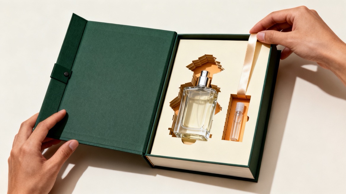
For premium presentations, a book-style rigid box with a magnetic closure can create a deliberate opening ritual. This format is well suited to high-value fragrance launches, collector editions, gift sets, and influencer mailers.
A good magnetic box should open smoothly, remain aligned, and hold its shape after repeated use. The interior should be just as considered as the exterior.
You can use:
- A fitted paperboard insert
- A wrapped foam insert for heavier bottles
- A ribbon lift for the bottle
- A printed interior message
- A fragrance story card
- A dedicated compartment for samples or a travel spray
Minimalism does not mean eliminating the unboxing experience. It means ensuring that each layer has a purpose.

The best perfume packaging format depends on your bottle weight, dimensions, target price point, distribution channel, and desired customer experience.
| Box Structure | Best For | Main Advantage | Production Consideration |
|---|---|---|---|
| Folding carton | Standard retail perfume boxes | Lightweight and cost-efficient | Needs precise board selection for bottle protection |
| Lift-off lid rigid box | Luxury fragrances and gifts | Strong premium presentation | Requires accurate lid-to-base fit |
| Drawer rigid box | Discovery sets and collectible scents | Creates a layered reveal | Needs a durable pull mechanism |
| Magnetic book-style box | Gift sets and launch kits | High-end opening ritual | More material-intensive |
| Shoulder-neck rigid box | Premium signature fragrances | Strong structural identity | Requires skilled construction |
| Tube box | Artistic or gender-neutral collections | Distinctive shelf presence | Insert design is essential for bottle stability |
For a single perfume bottle, the inside fit matters as much as the outer box. The bottle should not shift during transit, but it should also be easy to remove without forcing the customer to shake or pull the package.
The most successful packaging projects are decided early—before artwork is finalized. Use this process to reduce surprises and improve production accuracy.
Start with three to five words that describe the fragrance line.
Examples include:
- Clean, botanical, calm, intelligent
- Bold, nocturnal, sensual, architectural
- Heritage, elegant, warm, collectible
- Fresh, transparent, gender-neutral, modern
These words should guide the material, color, typography, finish, and structure.
Provide accurate information about:
- Bottle height, width, and depth
- Cap size and cap material
- Bottle weight
- Fragile areas or decorative elements
- Whether the bottle is round, rectangular, asymmetrical, or custom-shaped
- Any secondary items, such as samples, cards, or refills
A custom insert should be engineered around the real product—not estimated from a photo or an approximate measurement.
Choose the structure based on how and where the product will be sold.
A department-store gift set may benefit from a rigid magnetic box. A fragrance launched primarily through e-commerce may need a lighter structure paired with a protective shipping solution. A discovery set may require compartments that keep multiple bottles organized and easy to identify.
Choose a small number of complementary details.
A refined minimalist package may include only:
- One wrap paper
- One printing color
- One finishing method
- One insert material
- One opening feature
This restraint makes production easier to control and helps the finished package feel coherent.
A physical sample is essential. Test the box with the actual perfume bottle and assess:
- Opening and closing force
- Insert fit
- Corner quality
- Print registration
- Color consistency
- Foil or embossing accuracy
- Scuff resistance
- Shipping protection
- Customer handling experience
A package can look excellent in a digital mockup but fail in the hand. The sample is where design intentions meet real manufacturing conditions.
Many consumers now look beyond the visual appearance of fragrance packaging. They want to understand what the materials are, whether components can be separated, and whether a brand's environmental claims are meaningful.
For paper-based perfume packaging, the most practical approach is to simplify the material mix where possible and clearly identify what customers can do with the box after use.
Consider these actions:
- Use responsibly sourced paper or board where documentation is available
- State recycled-content percentages only when they are verified
- Avoid unnecessary plastic laminations or mixed-material decorations
- Reduce oversized boxes and unused interior volume
- Design inserts to use less material while still protecting the bottle
- Use refill-compatible packaging concepts when they fit the product model
- Provide concise disposal instructions suitable for the markets you serve
Europe's Packaging and Packaging Waste Regulation is pushing the market toward less unnecessary packaging, improved recyclability, and broader reuse systems. Brands selling internationally should build flexibility into packaging design rather than treating these expectations as a future-only concern.
The important point is simple: a minimalist package is not automatically responsible. A package becomes more responsible when its materials, size, construction, and end-of-use instructions match the claim being made.
Minimalist perfume packaging can lose its impact when the details are not executed well.
Avoid these common problems:
- Using thin board for a product positioned as luxury
- Adding too many finishing methods to a supposedly simple design
- Choosing a font that becomes unreadable at small sizes
- Overfilling the front panel with marketing copy
- Designing the box before confirming bottle dimensions
- Using an insert that is either too loose or too difficult to remove
- Making broad environmental claims without material documentation
- Choosing a box size that creates excessive empty space
- Ignoring the shipping journey for e-commerce orders
A minimal design leaves little room to hide inconsistency. Each edge, surface, logo, and opening action must be controlled.
The best minimalist perfume packaging balances restraint and character. It protects the bottle, communicates the fragrance story, creates a satisfying first touch, and gives customers a reason to keep the box rather than discard it immediately.
At Maituohong Packaging, we help fragrance brands develop custom rigid boxes, folding cartons, gift boxes, inserts, and paper packaging solutions tailored to the product and market. From structural planning and material selection to printing, finishing, sampling, and mass production, our team can turn a packaging concept into a reliable retail-ready result.
If you are developing a new fragrance line or upgrading an existing perfume box, share your bottle dimensions, preferred style, target quantity, and packaging requirements with us. We will help you create a custom perfume packaging solution that looks refined, performs well, and reflects the value of your fragrance.
A minimalist perfume box uses limited colors, clear typography, controlled spacing, and carefully chosen finishing details. It avoids unnecessary graphics while using materials, structure, and tactile details to create a premium impression.
Yes. Rigid boxes are highly suitable for premium perfume packaging because they offer strong protection, accurate structure, and a more elevated unboxing experience. They are especially useful for luxury bottles, gift sets, and high-value fragrance collections.
The best insert depends on bottle weight, shape, and shipping needs. Options include paperboard inserts, wrapped foam inserts, molded pulp, and custom-cut platforms. The insert should hold the bottle securely while allowing easy removal.
Yes. Foil stamping can work very well in minimalist packaging when used selectively. A small foil logo, fragrance name, border, or emblem can add elegance without overwhelming the design.
It can be. Kraft paper is suitable for premium packaging when paired with strong rigid board, refined printing, accurate construction, and high-quality finishing. It is particularly effective for natural, botanical, artisan, and wellness-focused fragrance brands.
Use fewer mixed materials, avoid unnecessary plastic components, reduce oversized structures, choose paper-based components where appropriate, and provide clear disposal guidance. Verify any recycled-content or responsible-sourcing statements before using them in packaging copy.
Provide bottle dimensions, bottle weight, product quantity, desired box structure, preferred material, printing colors, finishing requirements, insert needs, target market, and any reference images or brand guidelines. This information helps a manufacturer recommend a more accurate solution.
1. [Tycoon Packaging — Minimalist Perfume Packaging Ideas]
2. [United States Environmental Protection Agency — Paper and Paperboard: Material-Specific Data]
3. [American Forest & Paper Association — Paper & Cardboard Recycling]
4. [European Commission — Packaging and Packaging Waste Regulation]
5. [Eurovetrocap — Cosmetic Refill Packaging: A B2B Guide to PPWR]
6. [Recycled Materials Association — Paper Commodities and Recycling Information]


