
Views: 247 Author: Maituohong Packaging Publish Time: 2026-08-30 Origin: Site


Content Menu
● Why Cereal Mascots Still Matter on Packaging
● What Makes a Cereal Mascot Memorable?
>> Five Building Blocks of Strong Mascot Design
● Famous Cereal Mascots and What Brands Can Learn
● From 1990s Cereal Boxes to Modern Brand Experiences
● Designing Custom Cereal Packaging That Works in Retail
>> The Front Panel: Win the First Three Seconds
>> The Side Panels: Turn Information into Engagement
● Choosing the Right Folding Carton Structure
>> Common Paper Packaging Options for Cereal Brands
>> Materials and Finishes That Add Value
● A Practical Mascot Packaging Development Process
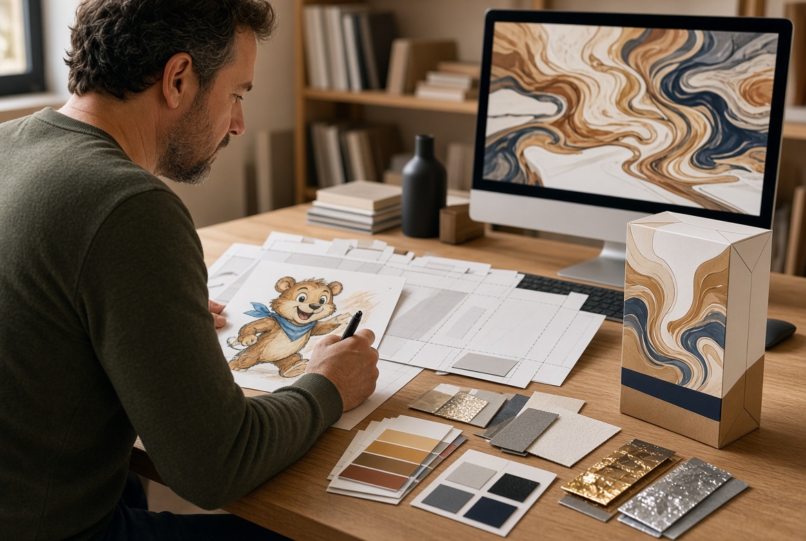
>> Step 1: Define the Brand Character
>> Step 2: Build a Packaging Content Map
>> Step 3: Select Structure and Material
>> Step 4: Review Artwork for Print Readiness
>> Step 5: Test Before Full Production
● Packaging Sustainability Without Empty Claims
● Why Custom Cereal Boxes Can Build Long-Term Brand Equity
● Create Custom Cereal Packaging with Maituohong Packaging
>> Why do cereal brands use mascots?
>> Who are the most famous cereal mascots?
>> What should be included on custom cereal packaging?
>> Which paperboard is best for cereal boxes?
>> Can cereal boxes use premium finishes?
>> How can cereal packaging be made more sustainable?
>> Can Maituohong Packaging produce folding gift boxes for cereal promotions?
A great cereal mascot does more than decorate a box. It gives a breakfast brand a recognizable face, a memorable voice, and a story shoppers can understand within seconds. From Tony the Tiger to the Trix Rabbit, iconic cereal characters show how thoughtful packaging design can turn an everyday food product into a lasting childhood memory.
For cereal brands, startups, private-label retailers, and promotional food businesses, the lesson is clear: custom cereal packaging is not only a container—it is a brand experience. The right mascot, structural design, printing finish, and unboxing interaction can build recognition on the shelf and encourage repeat purchase long after the first bowl is finished.

Cereal mascots have played a central role in breakfast branding for more than a century. The Quaker figure was registered as a trademark in the late nineteenth century, while well-known modern characters such as Tony the Tiger, the Trix Rabbit, Toucan Sam, and Lucky the Leprechaun helped define the visual language of packaged breakfast foods in later decades.
Their longevity is not accidental. A mascot can make a cereal brand feel more human, approachable, playful, and emotionally familiar. When shoppers scan a crowded retail shelf, they often process color, shape, facial expression, and visual cues before reading detailed product claims. A familiar character can therefore act as an immediate shortcut to brand recognition.
From a packaging-development perspective, I have found that the strongest mascot-led boxes balance three things:
- Instant recognition from several feet away.
- A clear product message that remains easy to understand at close range.
- A consistent visual personality across physical packaging, promotions, retail displays, and digital content.
This is why a cereal mascot should never be treated as a decorative afterthought. It should be designed as part of a complete packaging system.
The best cereal mascots are simple enough to recognize quickly but distinctive enough to remain memorable for years. Their effectiveness usually comes from consistent character design, repetition, emotional storytelling, and a visual connection to the product's flavor or benefit.
For example, Tony the Tiger has been associated with Frosted Flakes since 1952 and is built around energy, athletic encouragement, and the recognizable "They're Grrreat!" expression. The Trix Rabbit appeared in advertising in 1959 and eventually became the visual embodiment of the product's playful, fruit-forward personality.
| Element | Why It Matters | Packaging Application |
|---|---|---|
| Distinctive silhouette | Helps shoppers identify the brand quickly | Use a recognizable head shape, ears, nose, hat, tail, or body pose |
| Expressive personality | Creates emotional connection | Show excitement, curiosity, confidence, humor, or adventure |
| Brand-color alignment | Makes the character part of the visual identity | Match clothing, background, and accent colors with brand palette |
| Product relevance | Connects the character to flavor or product benefit | Use fruit, grain, honey, chocolate, or adventure cues |
| Repeatable storytelling | Makes campaigns easier to extend | Create seasonal scenes, collectible panels, games, and social content |
A mascot does not need to be a full cartoon universe. In many cases, a single expressive face, a signature gesture, or a recognizable color combination is enough. The key is consistency. If the mascot changes drastically from one product variant to another, consumers may not immediately connect the packages as part of the same brand family.
The most famous cereal mascots have each used a different branding strategy. Some communicate energy. Others create humor, fantasy, sensory association, or nostalgia.
| Cereal Mascot | Associated Brand | Core Personality | Packaging Lesson |
|---|---|---|---|
| Tony the Tiger | Frosted Flakes | Confident, athletic, encouraging | Use a bold hero character to communicate energy and positivity |
| Trix Rabbit | Trix | Determined, playful, mischievous | Create a recurring story that gives customers a reason to follow the character |
| Toucan Sam | Froot Loops | Adventurous, colorful, sensory-led | Connect the mascot directly to flavor, color, and discovery |
| Snap, Crackle, and Pop | Rice Krispies | Friendly, rhythmic, playful | Use multiple characters to communicate a product experience |
| Lucky the Leprechaun | Lucky Charms | Magical, clever, collectible | Build visual storytelling around surprise and discovery |
| Cap’n Crunch | Cap’n Crunch | Nautical, bold, imaginative | Use a themed world to expand packaging beyond a single panel |
| Count Chocula | Count Chocula | Seasonal, humorous, spooky | Adapt character design for limited editions and seasonal demand |
| BuzzBee | Honey Nut Cheerios | Friendly, nature-linked, energetic | Use an ingredient-related character to reinforce a key product cue |
The Trix Rabbit offers a useful example of long-term brand continuity. Trix cereal launched in 1954, and the rabbit debuted in a 1959 commercial before appearing on the box in 1960. That long-running character relationship shows how packaging can preserve a brand story across generations while still allowing visual updates.
Similarly, General Mills brought back Trix's fruit-shaped pieces in 2018 after consumer demand, demonstrating that packaging memories can become commercially valuable. Nostalgia is not simply a design trend; when handled carefully, it can be a bridge between older audiences and new shoppers.
Many consumers remember 1990s cereal packaging not only because of the product inside, but because the box offered something extra: games, puzzles, cut-out activities, collectible promotions, glow-in-the-dark graphics, temporary character updates, or a surprise in the pack.
That era created an important lesson for current cereal brands. A box can serve as a small interactive media surface.
Today, the interaction may look different, but the principle remains relevant. A custom cereal box can include:
- QR codes leading to recipes, games, brand stories, or loyalty content.
- Limited-edition mascot illustrations for holidays or collaborations.
- Collectible side panels that encourage repeat purchases.
- Simple breakfast challenges for families.
- Product-origin stories that explain ingredients or sourcing.
- Cross-promotional artwork for sports, entertainment, or seasonal campaigns.
- Recyclability instructions presented in clear, consumer-friendly language.
The important point is to make every interaction useful and on-brand. A QR code should lead somewhere meaningful. A game should support the personality of the mascot. A collectible design should feel intentional rather than random.
A cereal box has a demanding job. It needs to protect the product, communicate mandatory product information, stand upright in transport, perform well on shelves, and express a brand personality in a limited visual space.
For food products sold in the United States, packaging must typically accommodate information such as the product identity, net quantity, Nutrition Facts panel, ingredient statement, allergen declaration, and responsible business information. These requirements should be considered early in the artwork stage—not added after the front-panel design is complete.
The front panel should answer three questions immediately:
1. What is the product?
2. What makes it appealing?
3. Why should a shopper notice this brand instead of another one?
For mascot-centered cereal packaging, the front panel commonly includes the brand name, product name, main flavor or product image, mascot, weight statement, and selected product claims where appropriate.
A practical design hierarchy is:
1. Brand logo.
2. Cereal name or flavor.
3. Mascot face or hero pose.
4. Bowl or ingredient image.
5. Supporting claim or promotional message.
6. Net weight and required display information.
Avoid filling every empty space. Strong cereal packaging often uses bold color blocks and clear visual contrast rather than excessive text. The mascot should support the hierarchy, not compete with the product name.
The side and back panels are valuable brand real estate. They can carry nutrition and legal information, but they can also offer a deeper consumer experience.
Consider using these areas for:
- A short mascot origin story.
- Serving suggestions and recipe ideas.
- A "meet the ingredients" section.
- A child-friendly activity that does not distract from required information.
- Recycling guidance.
- A scan-to-learn panel for promotions or brand content.
- A family of related cereal flavors or snack products.
For premium brands, the inside of a folding carton can also become part of the experience. A subtle printed interior, hidden message, or small surprise illustration can create a more memorable opening moment without changing the outer shipping footprint.
Not every cereal product needs the same box style. The ideal structure depends on the product weight, inner bag format, retail channel, filling process, target price point, and desired shelf presence.
At Maituohong Packaging, our experience in rigid paper boxes and customized paper packaging helps us approach the structure and visual design as one integrated project. With more than 18 years of experience in high-quality paper packaging development and production, we understand that a beautiful design must also be practical for filling, shipping, storage, and display.
| Packaging Option | Best For | Key Advantage |
|---|---|---|
| Standard folding cereal carton | Mainstream retail cereal | Efficient, lightweight, familiar shelf format |
| Tuck-end folding box | Samples, specialty cereal, snack-size packs | Convenient opening and closing structure |
| Auto-bottom carton | Heavier product formats | Added bottom support and faster assembly |
| Window paper box | Granola, premium clusters, gift assortments | Lets shoppers see selected product features |
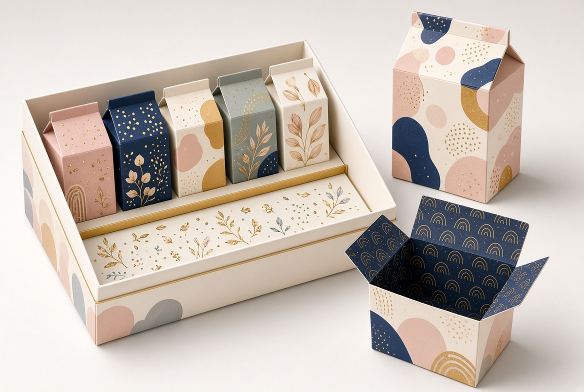
| Rigid gift box | Influencer kits, holiday promotions, premium bundles | Creates a high-end presentation and keepsake value |
| Multi-pack paper box | Retail sets and subscription packs | Organizes several flavors or portions in one unit |
For standard cereal retail, the folding carton is often paired with an inner food-safe bag that helps protect freshness. The outer carton provides the large printable surface needed for brand communication, while the inner barrier pack performs the primary freshness function.
A premium result does not always require a premium-looking finish on every surface. The most effective approach is to choose materials and finishing techniques that support the brand's position and budget.
Popular options include:
- SBS paperboard for a clean, smooth, high-quality print surface.
- Kraft paperboard for natural or organic product positioning.
- Matte lamination for a soft, contemporary appearance.
- Gloss coating for vibrant colors and energetic cartoon designs.
- Spot UV to highlight a mascot's eyes, logo, or product name.
- Foil stamping for limited editions, gifting, or festive promotions.
- Embossing or debossing for tactile brand details.
- Water-based coatings when a lower-plastic finishing approach is preferred.
The material choice should match the brand promise. A bright children's cereal may benefit from vivid graphics and gloss accents. A granola or wellness-focused cereal may be more credible in a restrained color palette with matte paperboard and ingredient-forward illustrations.
Creating custom cereal packaging becomes more efficient when branding, structure, regulatory information, and production requirements are planned together.
Start with a clear brief:
- Who is the target customer?
- Is the product aimed at children, families, adults, fitness buyers, or gift shoppers?
- What emotional role should the mascot play?
- What makes the cereal different from competing products?
- Is the visual tone playful, natural, nostalgic, premium, or adventurous?
A mascot should be designed around the brand strategy, not copied from a popular character style.
Before final artwork, identify where each item will appear:
- Front-panel brand name and product name.
- Mascot location and pose.
- Required product information.
- Nutrition and ingredient areas.
- Barcode placement.
- Promotional panel.
- Recycling information.
- QR code or digital engagement area.
This prevents last-minute design compromises and makes it easier to keep the package clean.
Choose box dimensions based on the inner bag, cereal volume, shipping requirements, retail shelf dimensions, and display preferences. A carton that looks appealing in a digital mockup but lacks stability during transportation will not deliver a good customer experience.
Artwork review should check:
- Bleed and safe areas.
- Color mode and color consistency.
- Font size and legibility.
- Barcode scanning clearance.
- Correct placement of required information.
- Mascot trademark ownership and licensing permissions.
- Image resolution.
- Finishing layers for foil, embossing, or spot UV.
A physical sample is important. It allows the brand team to evaluate shelf appearance, carton strength, opening experience, print color, text readability, and compatibility with the filling process.
For a new product launch, this test stage can prevent expensive rework later.
Sustainability is increasingly important in food and beverage packaging, but brands should avoid vague environmental language that cannot be supported. Consumers want packaging that is practical, understandable, and easier to handle responsibly after use.
Paper-based packaging can be a useful option because it can offer strong printing performance, efficient storage, and compatibility with paper-recycling systems where appropriate. However, the full package should be evaluated, including coatings, laminations, inks, adhesives, inner bags, and local recycling infrastructure.
The U.S. Environmental Protection Agency identifies containers and packaging as a major material category in municipal solid waste data, which is one reason brands are paying closer attention to material use and end-of-life communication.
For cereal brands, practical improvements may include:
- Reducing unnecessary board weight where product protection remains sufficient.
- Using responsibly sourced paperboard where available.
- Limiting complex multi-material decorations.
- Providing clear disposal instructions.
- Avoiding environmental claims unless they are specific and verifiable.
- Designing the carton for efficient shipping and palletization.
- Considering refill or multi-pack concepts for suitable product formats.
A responsible packaging decision is not just about choosing "paper." It is about balancing product protection, food safety, transportation efficiency, consumer usability, print quality, and realistic end-of-life outcomes.
Custom cereal boxes create value beyond the first purchase. They help brands build recognition, express product differentiation, and create a visual system that can expand across flavors, formats, and campaigns.
A strong mascot-led packaging system can support:
- New flavor launches.
- Seasonal product variations.
- Retailer-exclusive artwork.
- Promotional gift sets.
- Subscription boxes.
- School or sports partnerships.
- Licensed collaborations.
- Social-media campaigns.
- Premium limited editions.
Tony the Tiger's involvement in the Tony the Tiger Sun Bowl is an example of how a mascot can extend beyond the retail shelf into broader brand partnerships and community-facing programs. In 2019, the character became the first mascot to lend its name to a college football bowl game.
The opportunity for smaller cereal and food brands is not to imitate global icons. It is to create a character and package system that feels original, credible, and relevant to their specific customer.
A cereal box should protect the product, communicate clearly, and make the brand easier to remember. Whether you are developing a playful children's cereal, an organic granola range, a premium holiday gift set, or a private-label breakfast product, the right paper packaging can help turn your concept into a stronger retail experience.
Maituohong Packaging specializes in customized paper packaging, including folding gift boxes, premium rigid paper boxes, and tailored packaging solutions. Our team can support your project from structural concept and material selection to printing, finishing, sampling, and production.
Contact Maituohong Packaging today to discuss your custom cereal packaging project, mascot-led box design, premium paper gift set, or branded folding carton requirements.
A cereal mascot is a branded character used to represent a breakfast cereal product. It may be an animal, person, fantasy figure, or animated character designed to make the brand more recognizable and emotionally engaging.
Cereal brands use mascots to create visual recognition, communicate personality, make packaging more appealing, and support advertising across multiple channels. A strong character can help shoppers remember a brand more easily.
Some of the best-known cereal mascots include Tony the Tiger, the Trix Rabbit, Toucan Sam, Lucky the Leprechaun, Cap'n Crunch, Snap, Crackle, and Pop, Count Chocula, BuzzBee, and the Quaker figure.
Custom cereal packaging should typically include the product name, brand logo, product image, net quantity, ingredient information, nutrition information, allergen information, barcode, and responsible business details. The exact requirements depend on the intended market and product category.
SBS paperboard is widely used when brands need a smooth, bright printing surface and strong graphic quality. Kraft paperboard may be suitable for natural, organic, or rustic brand positioning. The best choice depends on product weight, design requirements, budget, and filling conditions.
Yes. Cereal boxes can use finishes such as matte or gloss lamination, spot UV, foil stamping, embossing, and specialty coatings. Premium finishes are especially effective for gift sets, special-edition launches, promotional kits, and high-end cereal products.
Brands can reduce unnecessary material, use responsibly sourced paperboard where suitable, design for efficient transport, limit hard-to-separate decorative layers, and provide clear disposal guidance. Any sustainability statement should be specific and supported by the actual packaging specification.
Yes. Folding gift boxes can be used for cereal gift sets, seasonal bundles, promotional packs, influencer mailers, subscription boxes, and premium multi-flavor assortments. They can be customized in size, structure, paper material, printing, and finishing details.
1. [Tycoon Packaging — World of Cereal Mascots: From Iconic Characters to Childhood Memories]
2. [General Mills — Celebrating 60 Years of the Trix Rabbit]
3. [General Mills — 10 Cereal Facts That Made Breakfast History]
4. [Quaker Oats — Quaker History]
6. [Kellanova Investor News — Tony the Tiger Claims Sun Bowl Title Partnership]
7. [U.S. Food and Drug Administration — Nutrition Labeling of Food, 21 CFR 101.9]
8. [Recipal — FDA Food Labeling Guide: Guidelines and Compliance]
9. [U.S. Environmental Protection Agency — Containers and Packaging Product-Specific Data]


